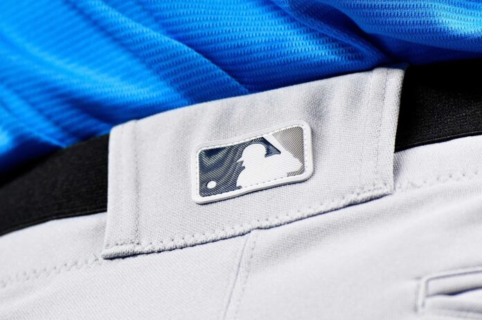
The MLB Players Association has updated its logo.
On Monday, the MLBPA announced that some changes would be made to their logo and gave fans a first look at the fresh new logo.
The logo features a modernized silhouette of a player swinging the bat.
The new logo symbolizes a new union between several player-centric organizations, such as the Players Trust and MLB Players Inc.
On Twitter, the MLBPA released a statement about the current state of affairs and the new logo, while offering a description of the new logo’s meaning, including the color scheme and what the union ultimately stands for.
FOR IMMEDIATE RELEASE: @MLBPA Logo Gets a Fresh Look
New Logo Unifies the Organization’s Suite of Brands
More: https://t.co/paDpPoUgoo pic.twitter.com/co5BlUyDnH
—MLBPA Communications (@MLBPA_News) February 6, 2023
The Players Union has grown stronger since the end of the lockout.
After a much fairer Collective Bargaining Agreement was reached in March, the Union has taken some strides.
Recently, the Union partnered with the minor leagues and announced that minor leaguers would be joining the MLBPA as they fight for better conditions for younger players, including salary benefits and living conditions.
But this new logo symbolizes the unity of the Players Association, which stood strong amidst the tenuous negotiations during the lockout last winter, which ultimately pushed back Opening Day by a week.
The player portion of the logo, as described by the Union in their statement, symbolizes the power of a swing, as well as the athleticism of all MLB players.
The Union and the League are entering the second year of the new Collective Bargaining Agreement, which was signed last March and ultimately brought an end to the lockout, which lasted 99 days.

